Inspiration: Six Movies: Season 2 Episode 10
Katie and Dawn discuss three inspirational movies each, in which architecture and design are key players but not necessarily the subject of the film.
Dawn gets the episode started with a discussion of The Grand Budapest Hotel. Dawn says “I now understand the popularity of Wes Anderson's films.” What a wild adventure. A totally eccentric visual and narrative style. The wow factor, from her design perspective, is Anderson’s use of color in both set design and costumes. Set in the fictional Eastern European country of Zubrowka, we see the hotel’s early days through flashback scenes where curtains and wallpapers are shown in 70’s-reminiscent olive, ochre and brown geometric patterns,
a cotton-candy pink hotel façade, and that elevator scene where the lobby boy, lift operator, and concierge are each dressed in bright, violet velvet uniforms set against a background of fiery bright orange walls.
Anderson’s vision transfixes the audience with a distinctive approach that is both unbounded and personal; an auteur among the likes of Hitchock and Truffaut. According to Jesse Fox Mayshark, an editor for the New York Times News Service, “Anderson’s films have a baroque pop bent that is not realist, surrealist, or magic realist, but rather might be described as fabulist”.
The first film Katie introduces is the Norwegian film Kitchen Stories, directed by Bent Hamer. Set in post-war 1940’s, the premise of Kitchen Stories is an in-home study, by the fictional Swedish Home Research Institute, of how Norwegian bachelors use their kitchens. In short order, a caravan of Swedish scientists — in vintage cars towing the buggy-shaped trailers they will occupy while conducting the study — wind their way into Norway.
Image courtesy of itpworld
So launches an absurd, amusing, and touching film about the modern world’s attempt to rationalize the sometimes irrational and always human.
Image courtesy of IMDb
Swedish scientist Folke sits in his hilarious high chair observing the kitchen of his Norwegian subject. This shot of the green board-and-batten kitchen interior, complete with quirky old-fashioned free-standing appliances, simple wooden table, and classic enamel elements, strikes Katie as so very vintage Scandinavian. Here, the kitchen is a room with independent furnishings where any number of versatile activities take place, the least of which is cooking.
The second inspirational movie that Dawn highlights is Black Panther. Dawn admits she is generally not a superhero movie goer; however as a longtime sci-fi enthusiast, she was drawn to this highly anticipated 2018 Marvel film set in the ‘Afrofuturist’ world of Wakanda. We see on screen the amazing, singular visions of costume designer Ruth Carter, production designer Hannah Beachler, and director Ryan Coogler. Carter’s exquisite garments were inspired by Massai, Zulu, and other African tribes.
According to the New York Times, “Hanna Beachler created a visual bible which laid out the districts and culture of Wakanda.” She stated, “We looked at the architecture of existing tribes, and then tried to advance the technology naturally rather than if Wakanda had been colonized.” Wikipedia notes that critics called Black Panther one of the best superhero films of the century, and a "refreshing answer to the increasingly stale world of superhero cinema."
The Modern courtyard and house (Villa Arpel) owned by Monsieur Hulot’s sister and his brother-in-law. Image courtesy of The Cinessential
Katie then sings the praises of a favorite movie Mon Oncle, a French film directed by Jacques Tati c. 1958. Tati plays the uncle, who is a reprisal of the cheerfully bumbling Monsieur Hulot (from his earlier film by the same name) in this quirky farce full of architectural wonderment. Having watched this film many times over the years, Katie recognizes that the filmmaker was commenting on the cold contrivances of Modern minimalism and mechanizations in contrast with the warmth and comfortable patina of old-town Paris. Yet, at the time of this most recent viewing, Katie was completely charmed by Villa Arpel, the playful small Modern home and courtyard, and the hilarious efforts of the architecture and design to rationalize human patterns of living. There’s a theme here, to these movie selections ;-) Katie believes that Tati was poking fun at Modernism, the way one teases, well, a favorite Uncle. Tati must have had a sweet spot for Modernism, how else could he and the set designers have created something as delightful as Villa Arpel?!
The eyes have it. (Madame Arpel, left, and Monsieur Arpel, right.)
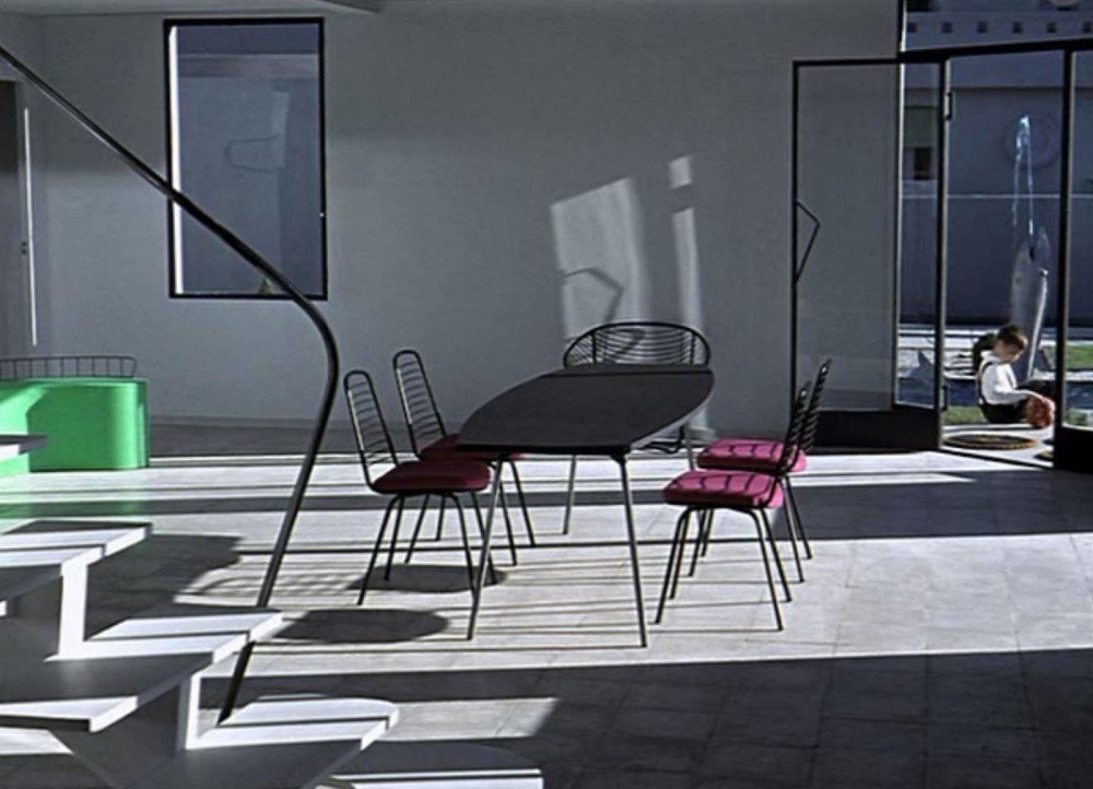
The spare interior of Villa Arpel opens to the courtyard and is splendidly washed in daylight, with the comical fish fountain and nephew Gerard in the background. Image courtesy of Offscreen
Lightweight and often comically uncomfortable, furniture at Villa Arpel is frequently moved around outside and in to suit whatever activity is planned. Upon this recent viewing, Katie found that the limited furnishings contribute to a refreshing versatility.
Monsieur Hulot in the kitchen of Villa Arpel. Image courtesy of ArchDaily
The rendition of a Modern kitchen is the wackiest of the Villa Arpel elements. Completely nonsensical. But its collection of free-standing appliances is not terribly far from the somewhat ad hoc look of the very unModern kitchen in Kitchen Stories.
Find a “An Interior” article about an installation at Design Miami inspired by Villa Arpel here.
Dawn’s third film is The Favourite, a wonderfully bizarre black comedy directed by Yorgos Lanthimos set in the early 18th century during the reign of a truly mad, sad Queen Anne. The story focuses on the rivalry between the Duchess of Marlborough and her younger cousin, Abigail Hill, to be court favorites. Choosing to shoot the scenes incredibly wide, Lanthimos states, according to a Wikipedia page, "from the beginning, I had this image of these lonely characters in a huge space", revealing over the top, lavishly tapestried bedrooms and banquet halls, long dimly lit hallways and a strict black and white palette of haute couture.
A review in the New York Times notes, "The work of the production designer Fiona Crombie and the costume designer Sandy Powell, among others provide more than decoration. They transport the viewer into a world where conventional distinctions — between private feeling and public display, between honesty and guile, between life and theater — do not apply."
A “matte painting” of the Vandamm House. Image courtesy of Hooked on Houses
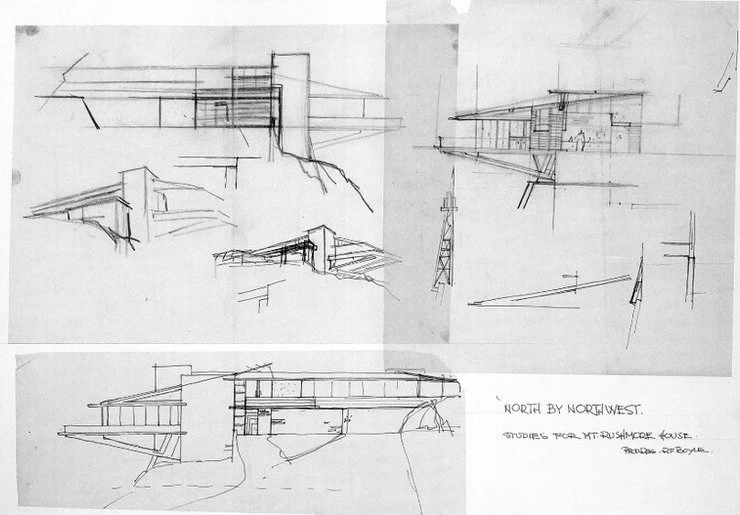
The last film that Katie discusses is North by Northwest, Alfred Hitchcock’s c. 1959 film about an ad man (Cary Grant) being mistaken for a CIA agent. There’s plenty of mid-century architecture featured in this classic tale of high-end shenanigans. It’s the house owned by the villain Phillip Vandamm (James Mason), shown toward the film’s climax, that got Katie’s attention. It’s a Modernist cantilevered marvel comprised of stone, steel, and glass à la Frank Lloyd Wright (FLW). If the internet is to be believed, Hitchcock and company are said to have approached FLW about designing the house, but his fee was 10% of the film’s budget. Instead, production designer Robert Boyle and his team dreamed up a FLW doppelganger design, a convincing one at that.
Image courtesy of Production Designers Collective
Apparently, sets of portions of the house were created for exterior and interior filming. Choosing to feature the house at night surely helped create the illusion of a real house. The horizontal massing, strong vertical anchoring element of stone masonry, large expanses of glass, natural wood accents, angle-topped windows, open plan, and cathedral ceilings are all FLW hallmarks. Katie comments that a current commission of hers that involves a house from the early ‘8o’s, designed by an architect with an apparent fondness for FLW design, has an interior with many of the same features.
Interior of the Vandamm House. Image courtesy of Hooked on Houses
That’s a wrap of this episode. Let us know movies that feature residential architecture and design (which isn’t necessarily the subject of the film) that you recommend.


